TeslCare : Building a Scalable, Multi-User Healthtech Platform from the Ground Up
Designing the Most Robust Healthtech Platform I’ve Ever Led
Role: Product Design Lead
Duration: 6 months
Scope: End-to-End UX for 10+ user types · Multi-role workflows, Mobile + Web · Website · Design System

10+ User Roles. One Platform. Designed from the ground up
We weren’t building an app. We were designing a full healthtech ecosystem, from scratch. It had to serve:
• Service Organizations (hospitals, blood banks, ambulance systems)
• Service Providers (doctors, nurses, lab techs, pharmacists)
• End Users (everyday patients and their families)
All on one unified platform. All using the product differently. All expecting it to feel simple. No design system. No existing UX foundation.
Just a shared dream..
What if accessing care felt as easy as booking a ride?
My Mission
As the Product Design Lead, I wasn’t just designing screens, I was building the structure, the patterns, the strategy, the language
I wasn't just designing screens. I was building the structure, logic, and visual language behind the platform.
My job spanned:
• Leading the UX for all user types across mobile and desktop
• Building a design system that could scale across 10+ roles
• Collaborating with engineers, QA, ops, and the CEO to ship usable features all while leading a design team of 2.
• Designing and launching the public-facing website, TelsCare.com
Designing for Complexity (Without Letting it Show)
So I mapped the experience around 3 pillars:
• Role Clarity — Each user only sees what they need
• Speed of Action — Every flow is optimized for under 60 seconds
• Human Feel — Designed to feel like care, not admin work
We mapped out user journeys for every type of user involved in delivering and receiving care:
Basically we had to make healthcare make sense.
Task lists, wound care tracking, photo uploads
👨🏽⚕️ Doctors
Consultation flows, prescriptions, patient handoffs
🧑🏽 Care Workers
Home visit notes, referrals, coordination tools
🧪 Lab Technicians
Test result upload, request management.

Dispatch systems, patient transfer logs
💊 Pharmacists
E-prescriptions, inventory, fulfillment UX
🧍 Patients
Appointments, messaging, medical records
🏢 Admins Dashboards
compliance tracking, user management
🏥 Organization Managers
Inventory, staff scheduling, reporting
So I designed around role-based UX clarity, show only what each person needs. Nothing more. Nothing less.
Empowering Users with AI: Meet Hikmah, Our Health Assistant
Healthcare is time-critical, repetitive, and emotionally taxing. From patients asking “What’s next?” to nurses buried in task lists, we saw an opportunity to create a conversational layer that:
• Guides users through tasks like referrals, documentation, care updates
• Answers common questions 24/7, especially when humans aren’t available
• Reduces nurse burnout by surfacing protocols, notes, and instructions instantly
• Learns user behavior to recommend next steps (e.g. “Want to update vitals now?”)We didn’t want it to feel robotic. So we spent time training tone, timing, and responses to make Hikmah feel human, but fast.
We integrated Hikmah across both patient and provider interfaces, so it could:
• Be a triage assistant for patients navigating their care plans
• Be a smart task manager for nurses, doctors, and admins (e.g., “3 patients need wound photos”)
• Help reduce drop-off rates by reminding users to complete pending forms
• Offer contextual nudges like:“Hey, want to refer Mrs. Ade to a wound specialist? You can do that now.
Unlike basic bots, Hikmah was trained on our actual workflows and embedded into the product logic, not a third-party integration bolted on. That meant:
• Fully contextual responses based on the user’s exact screen
• Integrated with patient records, task lists, vitals, referral pathways
• Load times under 300ms, even on mobile in low-bandwidth areas
• Designed to scale across geographies and languages.
It wasn’t just a chatbot. It was the first line of care navigation for thousands of users.

Redesigning the Nurse’s Day
Nurses were previously juggling Google Sheets, WhatsApp photos, and verbal reports.I redesigned it into a clean mobile-first flow:
→ Assigned task → Notes → Photo upload → Done.
Result: In test sessions, nurses documented care in 60% less time — with fewer errors and cleaner records. One nurse literally said:“It feels like someone finally thought about my day.”

%20(1).gif)
Referrals Made Easy
You refer a patient, then never know what happens next.We built a 3-step referral system that let care workers refer patients to specialists or labs with full visibility.
• Type of referral
• Provider directory
• Status updates: Pending → Accepted → Missed
🏥 Now providers know who they were sending patients to.
📈 And admins had a full referral audit trail.


Admin Dashboards Built Like Control Rooms
They needed to:
• Track overdue tasks. • Review patient referrals. • Manage staff and service providers. • View analytics on everything
I designed dashboards that put what mattered most first, and didn’t overwhelm.
During internal testing, admins said they could now resolve issues 40% faster compared to their legacy tools.

I Built the Design System From Scratch
• Tokenized colors, spacing, radius
• Components: Status pills, modals, alerts, dropdowns
• Used across patient app, admin dashboard, and provider views
• Annotated specs embedded in Figma
• Built for light + dark mode adaptability.
✅ Devs shipped faster
✅ Designers stayed consistent
✅ Everyone spoke the same visual language

I Also Led the Design of the Marketing Site
• Professional (for clinics)
• Trustworthy (for patients)
• Friendly (for partners and organizations)
I designed the brand color system, layout, copy tone, creative direction and lead gen flow.


What We Achieved (Before Even Launching)
✅ 10+ role-based user experiences designed end-to-end
✅ We designed and deployed an AI assistant — Hikmah — to support users with care instructions, smart triage, and task reminders, built seamlessly into the provider and patient journeys.
✅ 60% faster nurse documentation (from testing)
✅ 40% admin visibility increase (via dashboard workflows)
✅ 3 core verticals running on the same design system
✅ One team, two designers, 500+ screens shipped
What I Learned
When you’re building for nurses, doctors, and patients…
you’re not just designing apps, you’re designing relief. It stretched me.
I led with vision, delivered with systems, and collaborated with empathy.
And now I’m ready to lead at even greater scale.
🔎 Want to go deeper?
Some features in Telscare were so robust, they deserved their own spotlight.
→ [Explore the Referral Flow in detail] → [See how we designed Hikmah AI Assistant]
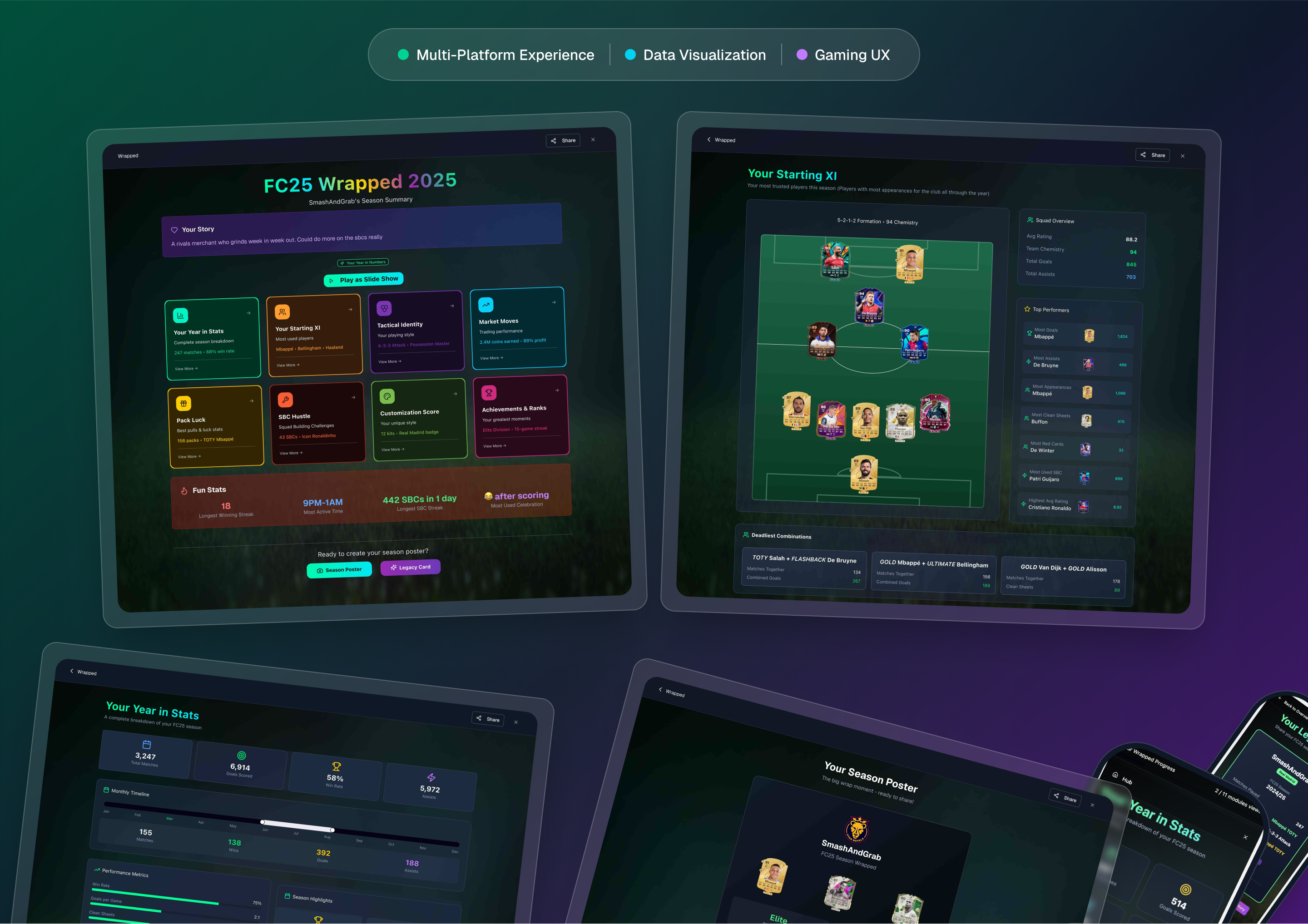
FC25 Ultimate Team Wrapped : UX & Product Design Case Study
I’ve always loved Ultimate Team, so I thought — why does it not have a “Wrapped” experience?
This is a personal concept — from the idea, to the design, to the final responsive build. It’s a love letter to the game and the community, showing how your biggest stats, highlights, and moments could be turned into an interactive year-in-review.
From research to responsive design, this case study explores how I transformed raw player data into an engaging, shareable, multi-platform experience.
Telscare : Designing the Most Robust Healthtech Platform I’ve Ever Led
As the Product Design Lead on this multi-role healthtech product, and it changed how I think about product design forever.
• Over 10 user roles.
• Built the design system from scratch.
• Dashboards. Referrals. Nurse tools. Admin control panels.
Patient chat. Lab & pharmacy flows.
• Even shipped an AI chatbot for triage and medical intent detection.
It was a 6-month sprint, and easily the most complex product I’ve owned end-to-end. From research to strategy to launch prep.
If you want a deeper dive into the workflows, check out the full case study 👇.
AI-Powered Candidate Preparation :
Enhancing Interview Confidence Through Intelligent Practice
The job interview process can be intimidating, especially when facing AI-driven assessments. This project introduces an AI-powered candidate preparation tool designed to help job seekers practice real-world AI interviews, receive instant feedback, and improve their confidence.

Knextt: A roster scheduling and task management mobile and web application
The intention is to build a scalable application with the ability to serve as many rosters and rotating responsibilities as required. However, for the MVP, we will be focusing on students and roommates before we deploy more features later on. In the near future, we want to become the go-to roster management application for individuals and enterprises.
Coming soon 🚧🚧. But you can view a mini prototype here.

EmoSync: Your Emotional Wellness Companion
EmoSync is a personal emotional wellness app designed to help users reflect, recharge, and grow. The app integrates personalized journaling, mood tracking, and mindfulness exercises, creating a holistic approach to emotional health.The goal is to make emotional well-being accessible, non-judgmental, and actionable for everyone. Starting with an MVP that focuses on simple daily check-ins and guided mindfulness, EmoSync aims to evolve into the ultimate companion for emotional self-discovery and growth.

CABSPM Tool Redesign
Our client, a Healthcare Agency, currently uses a project management tool developed by Anchor Group called "CABS Project Management" to manage their projects.
However, user feedback implies that the tool is not entirely user-friendly and can be difficult to use. As the UX Designer i performed a thorough UX audit and implemented a redesign of the existing system which made it a more intuitive and user-friendly system as explained in the case study.

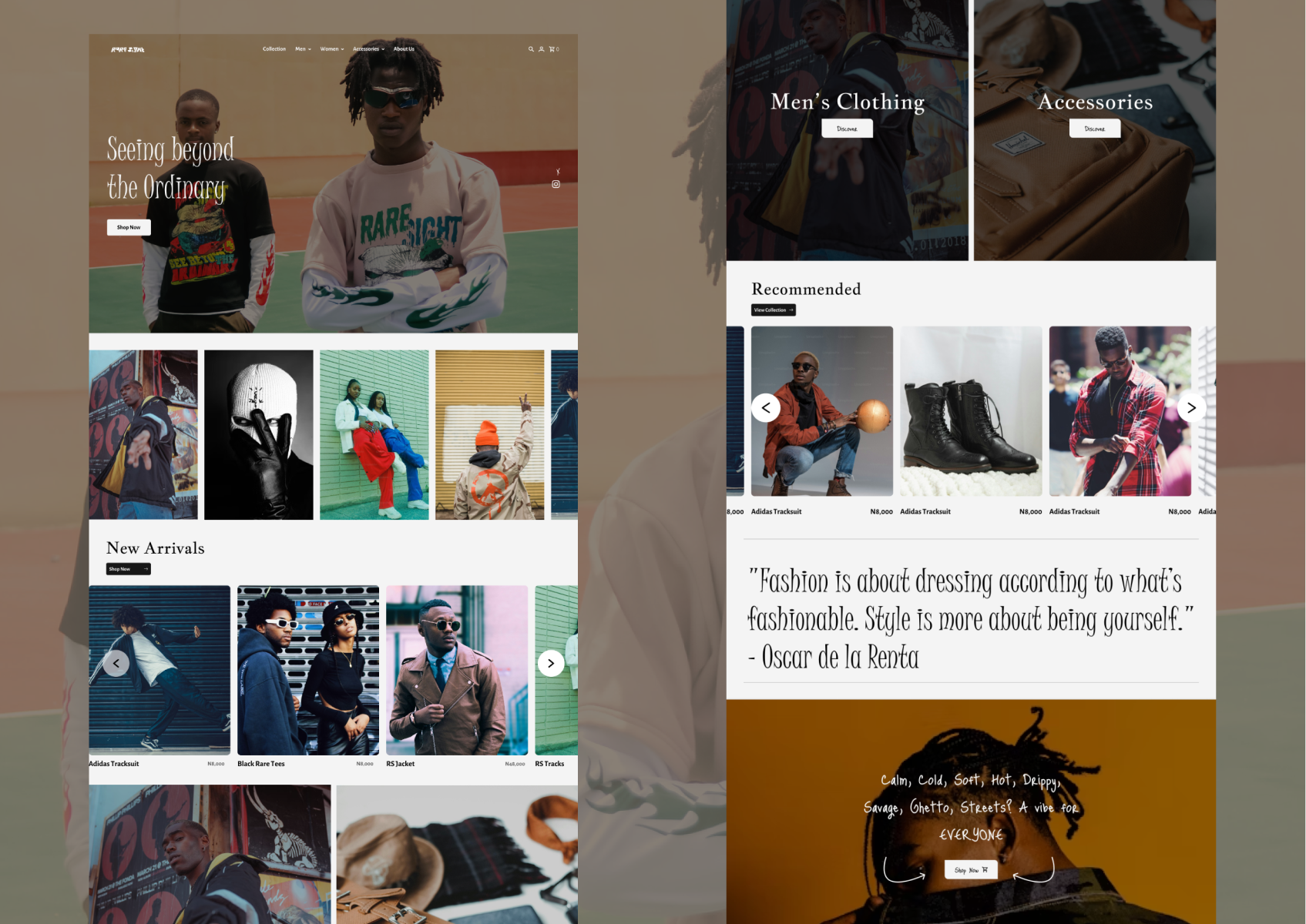
RareSight : Bold Fashion Meets Seamless Design
A high-energy, statement-driven fashion website created for trendsetters and style enthusiasts. From fresh drops to iconic vibes, RareSight brings personality to every click. Designed in collaboration, this project combines vibrant visuals with smooth navigation, ready to “see beyond the ordinary.” 🚧 Launching soon!
RentEasy : Real Estate App for Home Owners and Renters
An intuitive real estate app designed to make finding a home as easy as scrolling. From onboarding to property browsing, RentEasy connects homeowners with renters seamlessly. This concept project combines sleek UI with user-centered design, ready for future expansion.

Anchorwise Survey Tool
AnchorWise is a SaaS survey tool. The application allows users to create and publish surveys to the public via several methods. It allows users to collect responses, manage participants, collect responses, generate statistics, and export responses to be analysed.

Crippy Mobile Application
Crippy is a mobile application designed to eliminate the ambiguity in the cryptosphere enabling users to trade, transfer or receive crypto via respective wallets with ease, it also facilitates frictionless use of digital currency.

TicketR: Ticketing Mobile App
TicketR is a mobile ticketing app designed to make it easy for users to purchase and manage tickets for a variety of events, including concerts, sporting events, and theater performances.
